Web
For the past 5 years I’ve worked with multiple brands across diverse industries to improve the user interface and user experience by reducing friction, fatigue, and bounce rates. Each site is a new challenge in design thinking since each brand caters to a different audience.
Military Luggage CO
Military Luggage Company was looking to improve their user interface and migrate platforms. Their site was stuck in the 2000’s and needed a few decades of improvements. For starters, their categorization was a bit confusing. Due to their target audience–military members about to deploy–they needed to segment their products by military branch in order to reduce clicks and improve the user experience. Add in a streamlined checkout process and super clear CTA’s and they were almost ready to roll.
After looking at their analytics it was clear they needed to go mobile-first. They were losing nearly 45% of their customers due to an incredibly dated mobile experience as well as very hard-to-find CTA’s.
With an improved search bar, a mobile “mega-menu”, and improved UI, Military luggage noticed an increase in revenue of nearly 35% and an increase in conversions by 20%. Their transactions jumped 40% within a very short time of launch.
District Cutlery
Not only was District Cutlery looking to rebrand, they also wanted to juice up their website. Their custom knife sharpening service headquartered in Washington, D.C. had reached beyond their little shop via word of mouth from world-renowned chefs. They needed a way to ship and receive their orders and sell many of their custom-built knives, and their favorite brands.
After creating a new logo and color palette, rethinking their top level categories and their menu structure is what we needed to tackle next. Each TLC was unique so each menu needed to be different. The most design-intensive menu was the “Knife Types” menu. This navigation element features an interactive roll-over feature which displays an example of each type of knife as you hover over the name.
Another project to tackle was the item page layout. Before, it was nearly impossible to find the Add to Cart button, despite it being bright red. By putting the page elements into two columns, we were able to clean up the shopping experience. And because most of their products are one-of-a-kind, adding an “add to wishlist” option when products were out of stock gave customers a better alternative than shopping elsewhere.
ACE UNIVERSE
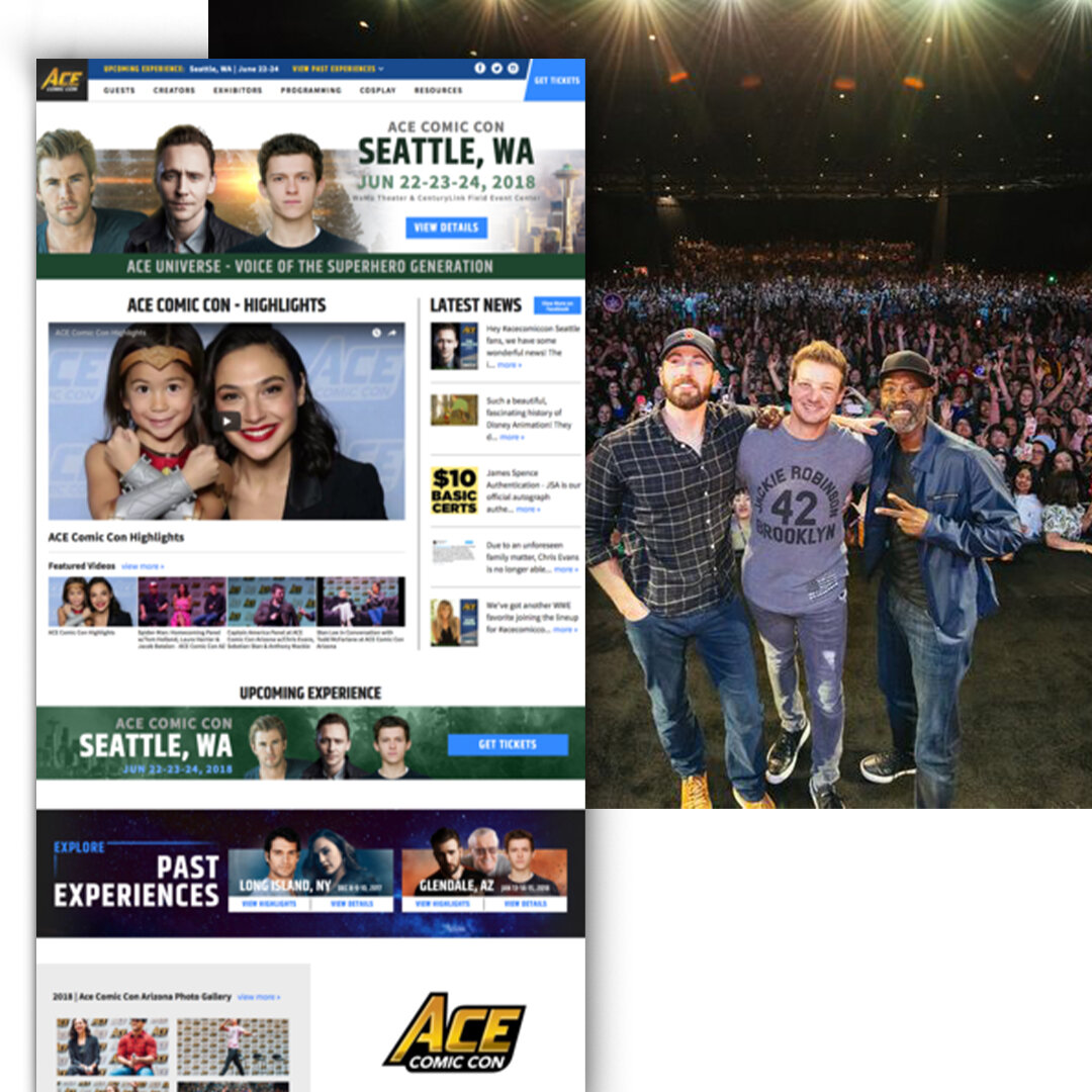
Ace Universe puts on the biggest and best Comic Cons. They needed a website that portrayed their brand’s quality and commitment to incredible experiences. Recognized by Forbes for being able to consistently deliver A-list celebrities to more meet-and-greets than any other, it came as no surprise they wanted a website that carried the same reputation.
With high-value items/experiences for sale, Ace needed a site that could be used as a billboard for their events, but also as a hub for content from events past. Integrating social feeds and photo albums into the design was a top priority. And we made sure they could do it all by putting them on the Magento platform.


